A Comprehensive Guide to Implementing a Design System in Jetpack Compose
I studied computer science for four years just to google stuff and I persuade Android into doing things for a living.
At Klivvr, our design system is the unsung hero that powers our digital experience from the seamless transactions on your mobile app to the intuitive interface that guides your financial journey. Think of it as the DNA of our product design—coding the visual and interactive elements that make Klivvr feel effortlessly smooth and reliable. Colors, icons, and buttons all play their part, creating a user experience so cohesive and polished that you don’t even have to think about it.
Without a design system, you’re navigating a risky terrain—where each inconsistency could lead to confusion, weaken our brand identity, or leave users frustrated. In this article, we’ll unpack the essentials of design systems, delve into why they’re crucial to Klivvr’s success, and show you how to build one that not only elevates our digital presence but also shields it from design disarray.
We’ll also explore how design systems can revolutionize your approach to Android app design and guide you through implementing them in Jetpack Compose, making Klivvr’s user experience even more seamless and engaging.
What is a Design System?
At its core, a design system is a collection of standardized building blocks and guidelines that ensure consistency across products and experiences. For us, it’s like having a blueprint that offers a unified language and structured framework, guiding our teams through the complex process of crafting digital financial solutions. This approach streamlines the design and development process, minimizing the need to reinvent elements and patterns, which saves valuable time and effort as we build and scale our products and interfaces.
Components of a Design System
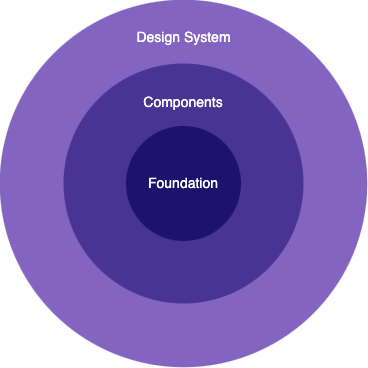
You can visualize the hierarchy in design systems like this:
1) Foundation
These are the building blocks that establish your product’s visual language, defining its look and feel through elements like color and typography. They also include icons, logos, illustrations, and crucial guidelines for accessibility and brand consistency, ensuring that everything from voice to tone aligns with your product’s identity.
2) Components
Here, you’ll discover reusable visual elements and interaction patterns that shape your product’s common interface and behavior. This includes templates, layouts, interaction patterns, code snippets, and components—each backed by detailed documentation to ensure consistency and efficiency throughout the design and development process.
3) Design System
At the top of the hierarchy is the design system itself—a comprehensive, ever-evolving resource that unites all foundational elements, components, and guidelines. It encompasses technical specifications, design tokens, documentation, and best practices, along with core principles and processes to steer UX design and product development across your entire ecosystem.
Why Use a Design System?
The true power of a design system lies in its ability to streamline workflows, ensure consistency across products, and foster collaboration among cross-functional teams. Whether you’re starting small or scaling across multiple platforms, a design system empowers the team to achieve more with less—not only in designing features but in bringing them to life.
At Klivvr, our design system serves as a single source of truth, eliminating design redundancy and speeding up the development process. Rather than spending time recreating components, our designers can draw from a library of brand-approved, development-ready options to quickly build out designs. With components crafted using code, tokens, and animation presets our developers can translate these designs into functional, accessible code in a fraction of the time. This approach has revolutionized Klivvr’s product development lifecycle, enabling us to bring products to market faster and deliver a seamless user experience.
Design System in Jetpack Compose
Jetpack Compose streamlines the implementation of a design system, making it easy to create a consistent look and feel for your app through theming, components, and more.
Getting Started
implementation "androidx.compose.material3:material3:$material3_version"
Once the dependency is added, you can start integrating Material Design elements such as color, typography, and shape into your apps, ensuring a cohesive and polished user experience.
Foundation
The foundation consists of essential subsystems like color schemes, typography, shapes, spacing, and themes. Customizing these elements automatically updates the components in your app, ensuring a consistent and personalized design throughout.
Color Schemes
The foundation of a color scheme is based on a set of key colors—primary, success, alert, danger, and neutral. Each of these colors corresponds to a tonal palette comprising several tones, which are utilized by Material components. For example:
internal object Color {
    object Base {
        val black = Color(0xFF000000)
        val white = Color(0xFFffffff)
    }

    object Light {
        val primary50 = Color(0xFFF3EEFE)
        val primary100 = Color(0xFFDECFFC)

        val success50 = Color(0xFFD8FDDE)
        val success100 = Color(0xFFB2E6CC)

        val alert50 = Color(0xFFFDF3D8)
        val alert100 = Color(0xFFFCE6A4)

        val danger50 = Color(0xFFF7E3E7)
        val danger100 = Color(0xFFF1A7B5)

        val neutral50 = Color(0xFFF4F4F6)
        val neutral100 = Color(0xFFECECEF)
    }

    object Dark {
        val primary50 = Color(0xFFDFD3F8)
        val primary100 = Color(0xFFB397ED)

        val success50 = Color(0xFFDCF9E1)
        val success100 = Color(0xFFB8E0CC)

        val alert50 = Color(0xFFFBF2DA)
        val alert100 = Color(0xFFF6E3AA)

        val danger50 = Color(0xFFF6E4E8)
        val danger100 = Color(0xFFEBADB9)

        val neutral50 = Color(0xFFF5F5F5)
        val neutral100 = Color(0xFFECECEF)
    }
}
Next, we need to establish the color tokens.
Color Tokens Contract
internal interface ColorTokens {
    // Base
    val baseWhite: Color
    val baseBlack: Color

    // Background
    val background: Color
    val onBackground: Color
    val onBackgroundVariant: Color

    // Primary
    val primary: Color
    val onPrimary: Color
    val primaryContainer: Color
    val onPrimaryContainer: Color

    // Success
    val success: Color
    val onSuccess: Color
    val successContainer: Color
    val onSuccessContainer: Color

    // Alert
    val alert: Color
    val onAlert: Color
    val alertContainer: Color
    val onAlertContainer: Color

    // Error
    val error: Color
    val onError: Color
    val errorContainer: Color
    val onErrorContainer: Color

    // Surface
    val surface: Color
    val surfaceContainer: Color
    val surfaceDim: Color
    val onSurface: Color
    val onSurfaceVariant: Color

    // outline
    val outline: Color
    val outlineVariant: Color
}
Light Color Tokens
internal object LightColorTokens : ColorTokens {
    override val baseWhite = Color.Base.white
    override val baseBlack = Color.Base.black
    override val background = Color.Light.neutral50
    override val onBackground = Color.Light.neutral900
    override val onBackgroundVariant = Color.Light.neutral500
    override val primary = Color.Light.primary400
    override val onPrimary = Color.Base.white
    override val primaryContainer = Color.Light.primary50
    override val onPrimaryContainer = Color.Light.primary400
    override val success = Color.Light.success600
    override val onSuccess = Color.Base.white
    override val successContainer = Color.Light.success50
    override val onSuccessContainer = Color.Light.success600
    override val alert = Color.Light.alert400
    override val onAlert = Color.Light.alert900
    override val alertContainer = Color.Light.alert50
    override val onAlertContainer = Color.Light.alert900
    override val error = Color.Light.danger400
    override val onError = Color.Base.white
    override val errorContainer = Color.Light.danger50
    override val onErrorContainer = Color.Light.danger400
    override val surface = Color.Base.white
    override val surfaceContainer = Color.Light.neutral50
    override val surfaceDim = Color.Light.neutral200
    override val onSurface = Color.Light.neutral900
    override val onSurfaceVariant = Color.Light.neutral500
    override val outline = Color.Base.black.copy(alpha = .1F)
    override val outlineVariant = Color.Base.black.copy(alpha = .06F)
}
As you can see, color tokens enhance the design process by replacing static values with intuitive names like “primary” or “on primary.” This method also allows us to define different values for light mode and dark mode while maintaining meaningful naming conventions, ensuring a seamless and adaptable user experience.
Next, we need to integrate the color schemes into a format that Material Design can recognize. We achieve this by creating a color scheme and passing in the color token values. While it’s possible to manually create a custom color scheme, it’s typically more efficient to generate one using your brand’s source colors. Here’s how to do it:
val colorScheme
    @Composable
    get() =
        if (isSystemInDarkTheme()) {
            darkColorScheme
        } else {
            lightColorScheme
        }

private val lightColorScheme =
    lightColorScheme(
        primary = LightColorTokens.primary,
        onPrimary = LightColorTokens.onPrimary,
        primaryContainer = LightColorTokens.primaryContainer,
        onPrimaryContainer = LightColorTokens.onPrimaryContainer,
        secondary = Color.Light.primary200,
        onSecondary = Color.Light.neutral900,
        background = LightColorTokens.background,
        onBackground = LightColorTokens.onBackground,
        surface = LightColorTokens.surface,
        onSurface = LightColorTokens.onSurface,
        surfaceVariant = LightColorTokens.surfaceDim,
        onSurfaceVariant = LightColorTokens.onSurfaceVariant,
        surfaceContainer = LightColorTokens.surfaceContainer,
        error = LightColorTokens.error,
        onError = LightColorTokens.onError,
        errorContainer = LightColorTokens.errorContainer,
        onErrorContainer = LightColorTokens.onErrorContainer,
        outline = LightColorTokens.outline,
        outlineVariant = LightColorTokens.outlineVariant,
        scrim = LightColorTokens.baseBlack,
    )

private val darkColorScheme =
    darkColorScheme(
        primary = DarkColorTokens.primary,
        onPrimary = DarkColorTokens.onPrimary,
        primaryContainer = DarkColorTokens.primaryContainer,
        onPrimaryContainer = DarkColorTokens.onPrimaryContainer,
        secondary = Color.Dark.primary200,
        onSecondary = Color.Dark.neutral900,
        background = DarkColorTokens.background,
        onBackground = DarkColorTokens.onBackground,
        surface = DarkColorTokens.surface,
        onSurface = DarkColorTokens.onSurface,
        surfaceVariant = DarkColorTokens.surfaceDim,
        onSurfaceVariant = DarkColorTokens.onSurfaceVariant,
        surfaceContainer = DarkColorTokens.surfaceContainer,
        error = DarkColorTokens.error,
        onError = DarkColorTokens.onError,
        errorContainer = DarkColorTokens.errorContainer,
        onErrorContainer = DarkColorTokens.onErrorContainer,
        outline = DarkColorTokens.outline,
        outlineVariant = DarkColorTokens.outlineVariant,
        scrim = DarkColorTokens.baseBlack,
    )
Next, let’s incorporate the color schemes into our custom theme.
@Composable
fun KlivvrTheme(
    content: @Composable () -> Unit,
) {
    MaterialTheme(
        colorScheme = colorScheme,
        content = content,
    )
}
Usage
KlivvrTheme {
    Text(
        color = MaterialTheme.colorScheme.primary,
        text = "Awesome text",
    )
}
That’s it! Your text color will now dynamically adjust in response to dark mode changes. Furthermore, with color tokens in place, altering the color values is as easy as directing a token to a different color value, and these changes will reflect instantly across the project without requiring any adjustments to the UI components.
MaterialTheme.colorScheme. This enables us to access these colors in the same way we access other colors within the Material theme.val ColorScheme.success: Color
@Composable
get() =
if (isSystemInDarkTheme()) {
DarkColorTokens.success
} else {
LightColorTokens.success
}
Typography
Typography is just as fundamental to a design system as colors and components. Establishing patterns for consistent and legible typography early in the design process is essential. This approach not only facilitates scaling typography across various applications and devices but also simplifies the handoff between designers and developers.
Material Design outlines a type scale with a streamlined naming and grouping system that includes display, headline, title, body, and label. Each category is further divided into large, medium, and small sizes, ensuring clarity and coherence throughout your design.
Similar to the color scheme, we will start by defining the text style contract.
internal interface TextStyles {
    val displayLarge: TextStyle
    val displayMedium: TextStyle
    val displaySmall: TextStyle

    val headingLarge: TextStyle
    val headingMedium: TextStyle
    val headingSmall: TextStyle

    val titleLarge: TextStyle
    val titleMedium: TextStyle
    val titleSmall: TextStyle

    val bodyLarge: TextStyle
    val bodyMedium: TextStyle
    val bodySmall: TextStyle

    val labelLarge: TextStyle
    val labelMedium: TextStyle
    val labelSmall: TextStyle
}
Next, we can define different styles of implementation for dark and light modes tailored to each locale. For example:
English text styles (Light/Dark)
private object TypeEN {
    private val fontFamilyResId = R.font.hauora

    object Light : TextStyles {
        override val displayLarge =
            getTextStyle(
                fontFamilyResId = fontFamilyResId,
                fontSize = 56.sp,
                lineHeight = 60.sp,
                weight = 700,
                letterSpacing = -1.20f,
            )
       // Same goes for the rest
    }
}

private fun getTextStyle(
    fontFamilyResId: Int,
    fontSize: TextUnit,
    lineHeight: TextUnit,
    weight: Int,
    letterSpacing: Float,
) = TextStyle(
    fontFamily =
        FontFamily(
            Font(
                resId = fontFamilyResId,
                variationSettings = FontVariation.Settings(FontVariation.weight(weight)),
            ),
        ),
    fontSize = fontSize,
    lineHeight = lineHeight,
    letterSpacing = (letterSpacing / 100) * fontSize,
)
Next, we can generate our Material Design typography in the same way we created the color scheme.
val typography
    @Composable
    get() =
        if (isSystemInDarkTheme()) {
            TypeEnDark
        } else {
            TypeEnLight
        }

val TypeEnLight = Typography(
    displayMedium = TypeEN.Light.displayMedium,
    headlineLarge = TypeEN.Light.headingLarge,
    headlineMedium = TypeEN.Light.headingMedium,
    headlineSmall = TypeEN.Light.headingSmall,
    titleLarge = TypeEN.Light.titleLarge,
    titleMedium = TypeEN.Light.titleMedium,
    titleSmall = TypeEN.Light.titleSmall,
    bodyLarge = TypeEN.Light.bodyLarge,
    bodyMedium = TypeEN.Light.bodyMedium,
    bodySmall = TypeEN.Light.bodySmall,
    labelLarge = TypeEN.Light.labelLarge,
    labelMedium = TypeEN.Light.labelMedium,
    labelSmall = TypeEN.Light.labelSmall,
)

val TypeEnDark = Typography(
    displayMedium = TypeEN.Dark.displayMedium,
    headlineLarge = TypeEN.Dark.headingLarge,
    headlineMedium = TypeEN.Dark.headingMedium,
    headlineSmall = TypeEN.Dark.headingSmall,
    titleLarge = TypeEN.Dark.titleLarge,
    titleMedium = TypeEN.Dark.titleMedium,
    titleSmall = TypeEN.Dark.titleSmall,
    bodyLarge = TypeEN.Dark.bodyLarge,
    bodyMedium = TypeEN.Dark.bodyMedium,
    bodySmall = TypeEN.Dark.bodySmall,
    labelLarge = TypeEN.Dark.labelLarge,
    labelMedium = TypeEN.Dark.labelMedium,
    labelSmall = TypeEN.Dark.labelSmall,
)
Next, let’s incorporate the typography into our custom theme.
@Composable
fun KlivvrTheme(
    content: @Composable () -> Unit,
) {
    MaterialTheme(
        colorScheme = colorScheme,
        typography = typography,
        content = content,
    )
}
Usage
KlivvrTheme {
    Text(
        color = MaterialTheme.colorScheme.primary,
        style = MaterialTheme.typography.bodyMedium,
        text = "Awesome text",
    )
}
That’s it! Your typography will now dynamically adjust in response to dark mode or locale changes. Plus, with typography tokens in place, updating the text styles is as simple as modifying the text style attributes, and these changes will instantly reflect across the project without requiring any adjustments to the UI components.
Spacing
A spacing system streamlines the creation of page layouts and UI. The consistent and intentional use of a spacing system fosters a more harmonious experience for the end user. A well-defined spacing system also lays the groundwork for responsive design and customizable UI density, enhancing the overall quality and accessibility of our products in the future.
Unlike color schemes and typography, spacing isn’t a predefined attribute in the Material theme. However, we can achieve similar declarative behavior by utilizing extension functions.
object Space {
    val space100 = 4.dp
    val space200 = 8.dp
    val space300 = 12.dp
    val space400 = 16.dp
    val space500 = 20.dp
    val space600 = 24.dp
    val space800 = 32.dp
}

val MaterialTheme.spaces get() = Space
Usage
KlivvrTheme {
    Text(
        modifier = Modifier.padding(MaterialTheme.spaces.space400),
        color = MaterialTheme.colorScheme.primary,
        style = MaterialTheme.typography.bodyMedium,
        text = "Awesome text",
    )
}
TL;DR
Design systems are crucial for crafting consistent and cohesive digital experiences, incorporating elements such as colors, typography, and components. They streamline workflows, uphold brand consistency, and enhance collaboration among cross-functional teams. This article delves into the fundamentals of design systems, highlighting their significance and offering insights on how to build and implement them effectively—particularly in Android app development using Jetpack Compose. It provides detailed guidance on creating color schemes, typography, and spacing systems to ensure a seamless and adaptable user experience.

