Klivvr Revamp: Putting the Fun in Funds
We’re thrilled to unveil the new Klivvr! In today's ever growing industry of digital transactions, we believe in making your financial journey as smooth and seamless as possible. We faced our fair share of technical challenges along the way, but with a bit of innovation and a whole lot of caffeine, we powered through creating a polished product that's as exciting to use as it was to create.
We wanted to enhance the banking experience and create an app that's smoother, faster, and more visually appealing than before. But we didn't stop there—we wanted to inject some personality into the mix, establishing a tone of voice that'll help you get to know us more.
The Process
Throughout the revamp process, our UX Researcher, Mai Soliman, gathered the team for a series of information architecture workshops that lasted way past bedtime. It wasn’t just about rearranging data; but also about reshaping how our users experience Klivvr. We were on a tight deadline and made every moment count by drawing on insights and feedback we'd previously collected.
Mai made sure everyone's voice was heard by creating a blend of our team's expertise mixed with real user perspectives. We dove into activities like card sorting and user journey mapping, uncovering areas where we could do better. The result? A new app structure that is not only intuitive, but also user-centric, empowering our users to manage their finances with confidence and ease.
The Foundation
After conducting a design audit, our Head of Product Design, Shehab Elnoury, led the charge with a coffee in his hand and a sprinkle of magic in his designs. He wanted to create a design system that was equally easy for designers to use and developers to follow.
Looks aside, we had to make sure that our revamp:
Enhanced the overall Klivvr experience
Shipped faster and more consistent designs
Sped up our developer handoff process
Supported color modes and internationalization (referred to as i18n for short)
We chose to build a more versatile design system: Klivvr Design, and started adopting design tokens. Design tokens are design decisions—such as color, typography, spacing, and more—that are used in place of hard coded values. They act as single source of truth allowing designers and engineers to maintain visual consistency as the product scales and new features get introduced.
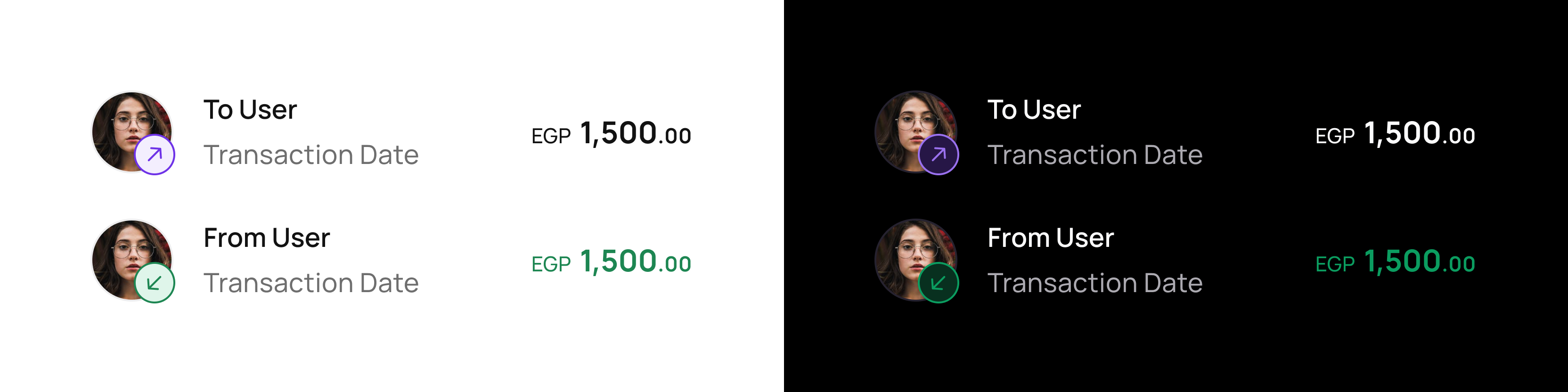
The transaction component using tokens in both light and dark modes.
We built components for our fundamental UI elements and migrated our color styles to variables (something you should consider too if you’re on Figma). When variables are combined with modes, they act like homonyms—words that have different meanings depending on context. While still in beta and lacking support for a wider range of tokens, such as motion and typography, being able to assign different values to color tokens made designing for dark mode less taxing since we no longer had to maintain two copies of each screen.
Though we’re still not at a 100% usage, and more components are being built, there’s been a significant improvement in terms of communication and consistency between design and engineering.
Tone of Voice
When it came to writing, we struggled with what to write, and how to write it. Mainly because our previous tone was inconsistent and didn’t fit well with our target. After intensive research and many trials and errors, we were able to create a unified tone across our application.
We predominantly use an active voice in our writing in order to leave little room for the user to wonder who is taking the action. We’re also always speaking to the user in a personalized manner, meaning that we speak using second-person point of view (you/yours). Respectively, we refer to ourselves in first-person plural (we/our/us).
Navigation & Usability
We created a new tab bar that allows users to move through our app in a way that requires minimal thought and feels comfortable, while also supporting the new features we were working on.
In our efforts to ensure that transacting is as quick as possible, we introduced the all-in-one transaction button. This allowed us to group together all money related transactions into one place.
Dark Mode
It has been shown that dark mode extends battery life, along with reducing eye strain in low-light conditions. So as part of our mission to become more accessible—and for those late-night money talks—dark mode quickly took a front row seat in our revamp journey.
With the design system’s foundation laid out, Marium Nour—our Product Designer—started building components for our UI Kit using the tokens. After multiple usability tests and several iterations, we were able to create a visually appealing dark version to our app that we were ready to share with our users.
Internationalization & Localization
Our previous writing process relied on comments left by our UX writer on Figma for the product designers to enter in each screen manually. When a comment was accidentally resolved before the designers attended to it, or a comma was forgotten, inconsistencies and incomplete content slowed us down. And since we currently operate in Egypt, and based on multiple user requests; we knew we had to start speaking in our native language.
To resolve this, we introduced a localization tool for multilingual support—Phrase Strings—that allowed us to no longer rely on comments, easily store and access all of our written content, and introduce كليڤر بالعربي in a more efficient manner. Not only was the introduction of a localization tool handy to our designers, but also to our developers. Translations are now unified across both iOS and Android, which ensures that any content update is always reflected on both platforms with a more clear structure.
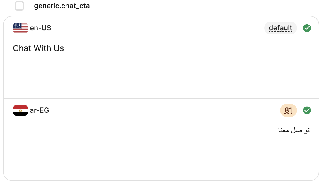
Creating a multilingual key on Phrase
What’s Next
At Klivvr, we believe that banking should be accessible for all. We've taken a leap into the world of digital finance, and with an engineering team as dedicated as ours, we were confident that we'll bringing you an experience that's as entertaining as it is efficient. We’re looking forward to you experiencing it for yourself and hearing your thoughts. Stay tuned for more updates coming your way!
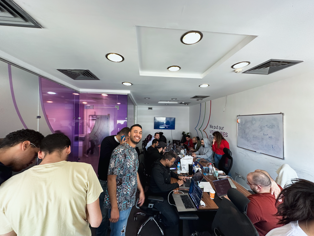
Our engineers bringing our vision to life in record time
Meet the Team!
Ahmed ElBadry, Product Designer
Mai Soliman, UX Researcher
Marium Nour, Product Designer
Salma Sabry, UX Writer
Shehab Elnoury, Head of Product Design
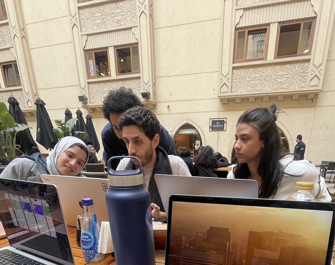
(Left to right): Mai, Ahmed, Shehab & Marium contemplating design decisions
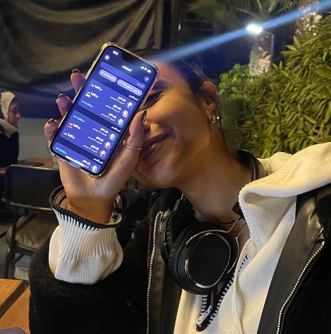
Marium with her pride & joy (Dark Mode)
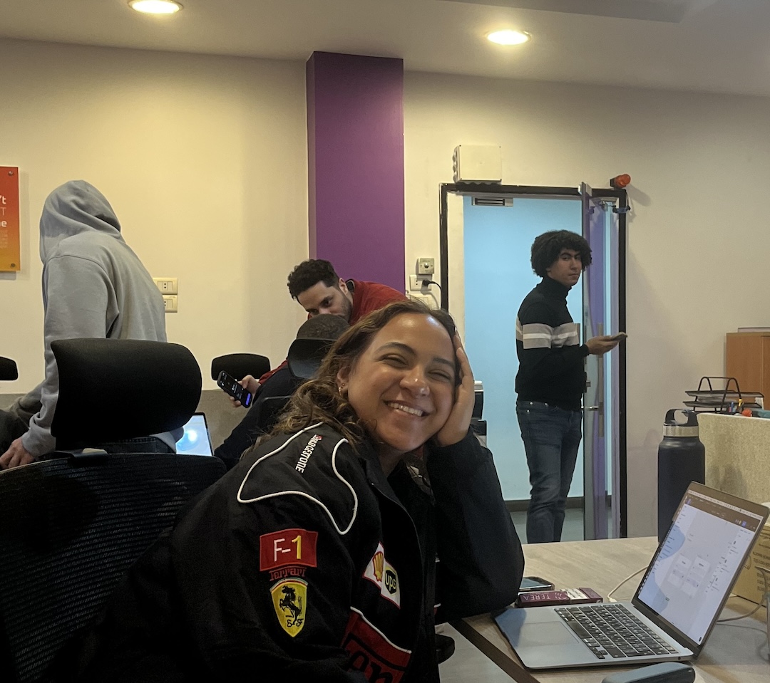
Racing to meet the revamp release deadline
At Klivvr, Shehab is synonymous with Figma